How to Use a Scatter Plot for Root Cause Analysis

Let’s say that you have a conveyor belt in your facility that keeps causing downtime, with maintenance fixing one specific conveyor belt over and over. You use the 5 Whys Method to determine possible causes and find:
- Parts on the conveyor could be too hot
- The conveyor is old and not being serviced frequently enough
- Maintenance is not doing the repairs correctly
- Downtime is being called in error to cover for another problem
Of these possible causes, you want to know which ones have an impact on the problem. One way to assess this question is with a scatter plot.
A scatter plot is a graphical representation of the relationship between two variables, offering a look at how closely two features are related. Let’s look at how to use a scatter plot to identify these relationships.
Download our free tip sheet so you can easily develop your own scatter plot diagrams for root cause analysis with a couple of simple steps!
Choosing Variables
The first step in creating a scatter plot is choosing your independent and dependent variables. In other words, which process parameter (independent variable) is causing the problem (dependent variable)? These variables correspond to the x and y axis, respectively.
As you create your scatter plot, it’s critical to choose variables that are simple, measurable and as objective as possible.
Let’s start with the first option on the list: Parts on conveyor could be too hot. If you wanted to test this idea, you might look at whether part temperature correlates with number of work orders on the conveyor.
Measuring Variables & Organizing Data
Now that you have chosen your variables, it’s time to measure them, either via observing the process or pulling data from a digital source such as part measurement system, maintenance system or mobile audit software.
Let’s say your data looks like this:
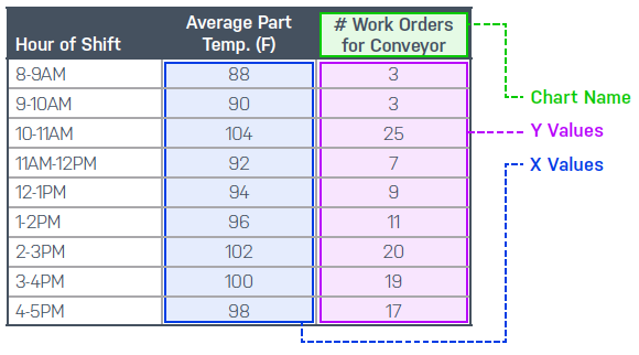
This is what you will use to generate your scatter plot. If your hypothesis is that the parts are too hot and damaging the conveyor, then increasing temperatures should correlate with more work orders.
Building Your Scatter Plot
Once you have your data collected, building the scatter plot and evaluating correlation is easy in a spreadsheet. In our example, you are looking at how many work orders happened at each temperature. That means temperature goes on your x-axis and number of work orders goes on your y-axis.

Evaluating the Results
In this example, we have a clear pattern. It is obvious that the data points trend upward. This means that there is a direct correlation between the temperature of the part and the number of work orders that are cut against the conveyor. This is solid evidence supporting your hypothesis that the heat of the parts is causing damage.
If you wanted to prove it further, you could do a linear regression in Excel to determine the R2 value, which tells you how strong the correlation is. The American Society for Quality (ASQ) describes correlation as a tight “hug” along a line in a graph.
R2, or the coefficient of determination, is a score of how well changes in x predict changes in y in your data. The closer to 1 the R2 value is, the more predictable your data is.
Next Steps
Now that you have identified a correlation between part temperature and equipment failure, you have a data-based defense for attacking a possible root cause.
In terms of next steps, recall from earlier in the example that there were multiple items listed as possible contributors to defects. So far, we have only assessed one of them.
Other root cause analysis tools you might use to assess the other items listed from the 5 Whys Method include:
- FMEA: For testing whether conveyor is being serviced frequently enough
- 5 Whys: For evaluating whether maintenance is not doing the repairs correctly
- Fishbone Diagram: To determine whether downtime is being called in error to cover for another problem
Scatter plots are useful for data sets of varying sizes to show correlation between an outcome and a potential cause. However, it’s important to note that correlation doesn’t equal causation. That is, just because there is strong correlation between two variables doesn’t mean that you’ve found the true root cause.
Ultimately, you’ll want to use scatter plots alongside other root cause analysis tools to determine where to apply your facility’s resources for continuous improvement. Looking at a problem from many different angles is the key to solving those problems—and developing permanent fixes that prevent defects from the start.
In case you missed it before: We developed a very simple and easy to follow tip sheet so you can create your own scatter plot diagrams and start analyzing your results quickly! Download it here.