How to Conduct Root Cause Analysis Using Pareto Charts

The Pareto Principle is a universal pattern that exists everywhere in the world, including in manufacturing. It’s a simple yet powerful rule that can help you identify waste in your processes and help you conduct more effective root cause analysis.
In the 19th century, Italian economist Vilfredo Pareto observed that 80% of the wealth in Italy was held by 20% of the population. While ahead of its time, this concept was later found to apply to nearly every relationship imaginable:
- 80% of the work in a department is completed by 20% of its people
- 80% of the errors in a production line come from 20% of its machines
- 80% of a firm’s problems come from 20% of the causes
- 80% of bad parts come from 20% of suppliers
In the manufacturing environment, creating a Pareto chart is a great way to visualize this concept. The chart will not only show you where your problems are, but point you in the right direction when conducting root cause analysis.
Learn more about Root Cause Analysis Tools for More Effective Problem-Solving
Collect Your Data
As with many quality processes, it all starts with data collection. First, you have to choose what you’re going to count and for how long. For example, let’s say you have an assembly line that stops a lot and you want to figure out why. Any number of reasons could be causing the problem, so you’ll need to make a list of the common causes and count when they happen.
In this scenario, the assembly line stops because of one of the following reasons:
- Missing parts
- Missing tools
- Wrong parts
- Blocked line
- Maintenance issues
- Other
The “other” category is for issues you haven’t thought of yet. The next step is to sit on the line each day for a set period of time—let’s say five days straight—and mark down when the line stops moving and why.
If it’s a missing part, record an occurrence for that category. If the line can’t move because the area ahead of it isn’t moving, record an occurrence in the blocked line category. Once observation is complete, you can put the data into a graph format.
Create Your Pareto Chart
Now that you have your numbers, let’s arrange them in a way that makes sense of the data. You can do this in Excel, or if you’re using an automated audit platform like EASE, it will create the graph for you.
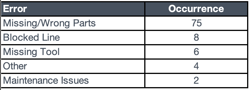
Step 1: Tally Your Data
This is the easy part. Take your notes from your observations and tally up all of the occurrences for each category. In this example, your table might look something like this:
Step 2: Re-Order Your Data
The next step is to reorder your data with the highest number of occurrences first, and even here you’ll be able to start picking out a pattern.
Step 3: Create Your Bar Graph
Now that your information is in order, create a bar graph with your reordered data.

Step 4: Add Your Cumulative Line
This last step is the trickiest part, but it is the heart of the Pareto chart. Create a cumulative count of all errors and graph it as a new line. Adding this line will give you a visual of where the bulk of your problems are.

You’ll need to change the cumulative data to a line and plot it on the secondary y-axis so that it shows the correct proportion of errors. The purpose of this cumulative line is to show how aggressively each new item adds to the overall number of errors. You may find in your root cause analysis that multiple errors add up to 80% of problems. This is where plant floor audit and insights software like EASE really come into their own to not only capture the data but automatically create the Pareto chart for you.
How to Use Your New Pareto Chart
From here, you can see plainly where you should focus your efforts. In this example, the Missing/Wrong Parts category is the biggest contributor to the line stoppage issue. If you repeated the observations and just recorded parts issues in more detail, you would see another Pareto pattern emerge.
By focusing on the aspects of a process that are creating the most waste or defects, you can set yourself up to solve the problems with the most impact first. It’s important to note that not all problems are equally important to solve. Sometimes it’s more beneficial to hit the complicated problem that happens often instead of the simple problem that only happens once a year.
It all comes down to assessing which issues carry the biggest risk to customers, your organization and overall safety and quality. Pareto charts can be tricky to master, but once you get the technique down, you’ll find them a powerful tool for root cause analysis and improving quality.